How to disable (AdSense) ads on mobile devices with Advanced Ads
I know from a lot of testing that it is sometimes wise to use other ad placements for mobile devices than for desktop devices. In this tutorial I am going to show you how I do set this up for AdSense, but also other ad types.
With Advanced Ads there are a couple of methods to either activate ads only on mobile or desktop or partially disable ads for specific browser widths. The three methods you can use in order to set this up are explained below.
- Using the “mobile” Visitor Condition
- Enabling ads for specific browser widths
- Hide AdSense ads on specific browser widths
Disable AdSense on mobile devices
Contents
In Advanced Ads there is already a visitor condition called mobile device that allows you to display an ad only on mobile or desktop devices.
Just search for the Visitor Conditions meta box on the ad edit screen. Select and add the new condition like on the screenshot below.
Once you added the condition to the active visitor conditions you can set it like on the screenshot below in order to display the ad only on mobile devices.

You can also do the opposite and hide the ad on mobile devices – resp. display them on desktop devices only – setting the select box to is not.
Just a few notes on this method:
- tablets are counted as mobile devices
- might not work well on cached websites (see point 2 and 3 below)
As a publisher I don’t care much about the device, but more about the fact that the ad actually fits the screen. Therefore, the two following methods seem to result in better yields.
Enable AdSense ad for specific browser widths
With the Responsive add-on for Advanced Ads you can disable ads for specific browser widths.
After installing the add-on you will find another visitor condition that allows you to select the browser width for which to enable or disable the ad.
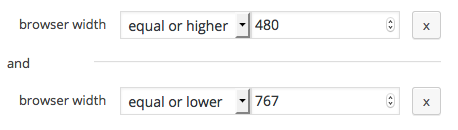
Search for the browser width condition in the Visitor Conditions meta box.

Here is an example from the Advanced Ads manual to display an ad only for a browser width of at least 480 pixels and a maximum width of 767 pixels. This aims for tablets and larger mobile devices smaller than an iPad.
The beauty of this setting is that you can fine tune your ad delivery by the actual available space rather than the information the device sends out.
If you are using cache on your website you should enable cache-busting of Advanced Ads Pro in order to dynamically check the condition on each page impression and to not accidentally cache a mobile ad for desktop devices or vice-versa.
This method is universal for every ad, not just for AdSense. If you are using only AdSense, you should use the next method that works on cached and un-cached websites.
Hide AdSense ads on specific browser widths
Method 2 is perfect if you mix AdSense with other ads, but if you only deliver AdSense ads on one spot and want to display different sizes based on the browser width or even hide the ad on some sizes completely then you should use this method.
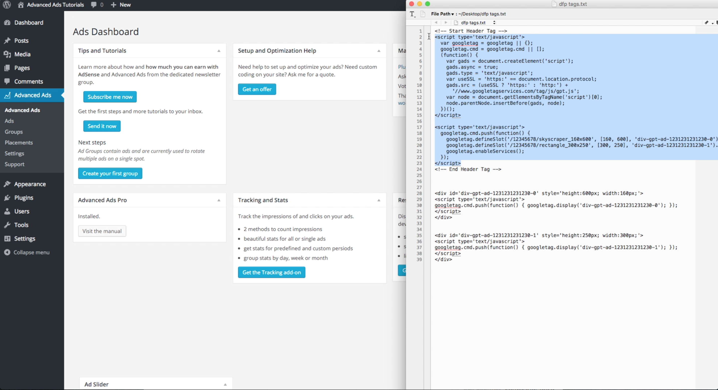
Basically, we are setting up an AdSense responsive ad with custom sizes. This is an option that was removed from the AdSense interface some months ago, so not many publishers know about it.
The Responsive add-on makes it very easy to set up a single AdSense ad with multiple sizes or even hide it.
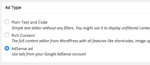
First, make sure that you selected the AdSense type for your ad, like in the image below.
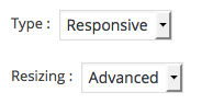
Now, go to the Ad Parameters meta box and select Responsive as the AdSense type and Advanced as the Resizing option. Be sure to activate the Responsive add-on to make these options available.
After choosing these options you should see the following box.
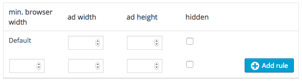
Enter the default size of your ad in the first row and use the second row to add additional rules. Check the hidden option in case you want to hide the ads on the current width.
Let me give you two examples.
1. Hide the ad on mobile devices
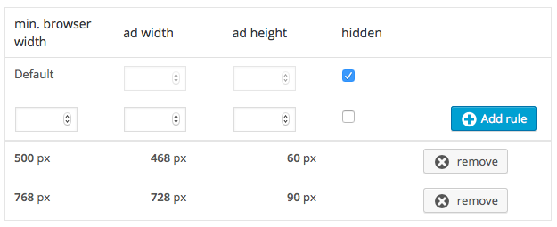
This setup hides the ad on small screens below 500px, but displays a Full Banner (468×60) on medium size screens and a Leaderboard (728×90) on large screens.
2. Hide the ad on desktop devices
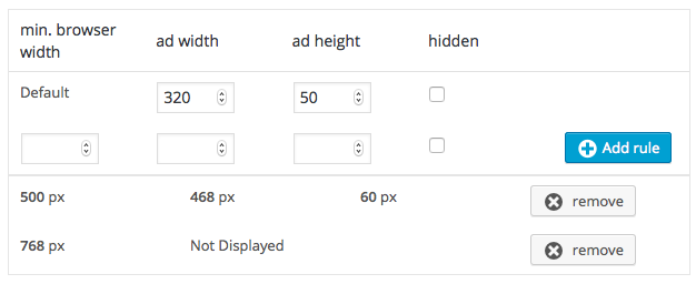
This setup displays a Mobile Banner (320×50) on small devices, a Full Banner (468×60) on medium devices but hides the ad on devices larger than 768 pixels.
Setting up a responsive ad like this works with caches and can even improve your yields, because popular ad sizes normally have higher bids then the fully responsive ones.
You shouls also know that an ad hidden like in the two examples above does not count for the max-3-ads-per-page rule, so you can indeed have a complete different setup for various browser widths.