Responsive Google Ad Manager Ads Tutorial
Google Ad Manager (GAM) is a powerful hosted ad server with a bucket full of free features. While most of the options are available through the interface, you can use a few only with custom code. Among them is the possibility to deliver ads based on the browser size.
In the following tutorial, I will explain how you can set up such responsive ads in Google Ad Manager and deliver different ad sizes based on the available space with or without touching the code.
There are a lot of ad networks offering “Responsive ads” nowadays. Their essential feature is to deliver ads that fit the screen size. Hence, a visitor using a small device sees a smaller ad than one who comes to your site on a large desktop monitor.
You might know responsive AdSense ads. They consist of rather unified ad layouts that adjust headlines, text, and images to fill the available space dynamically.
Responsive ads in Google Ad Manager work differently. Compared to AdSense, you are responsible for uploading the ad content yourself. It is your task to match these “creatives” to the available space on your site.
Traditional creatives in Google Ad Manager have a fixed size. Responsive Google Ad Manager ads match these fixed-sized ads with specific screen sizes.
In a most simple example, you can set up the same ad unit to deliver creatives with a size of 728×90 (leaderboard) on screens larger than 1000 pixels while falling back to a 300×250 or 320×50 on smaller screens.
Matching ad sizes with minimum screen widths using Advanced Ads.
sizeMapping
Contents
If you have been around for a while, let’s say when Ad Manager was called Google DoubleClick for Publishers (DFP), you might know responsive ads under the name of “sizeMapping.”
Size mapping is the technical term for responsive Google Ad Manager tags. The name comes from the JavaScript function used to implement it. We will come to that later.
Limitations of responsive Google Ad Manager ads
As mentioned above, Google Ad Manager does not provide ads that automatically fit into the available width. For each ad size you want to display, you first need to upload a creative and target it as part of a line item through an ad unit.
There is one exception to GAM ad units not being responsive by default: Native ads are fully responsive while a bit challenging to set up in Google Ad Manager.
Tip: I try to keep to a few standard sizes like 320×50, 300×250, 336×280, and 728×90. The more sizes you deliver through your ad units, the harder it might be to keep track.
Screen width vs. available width
The biggest downside of responsive Google Ad Manager tags is that they use the size of the browser to determine the delivered ad unit size. However, the space available for ads is often narrower than the full-screen width. Especially on desktop devices, you will always have a more or less wide border left and right of the ad.
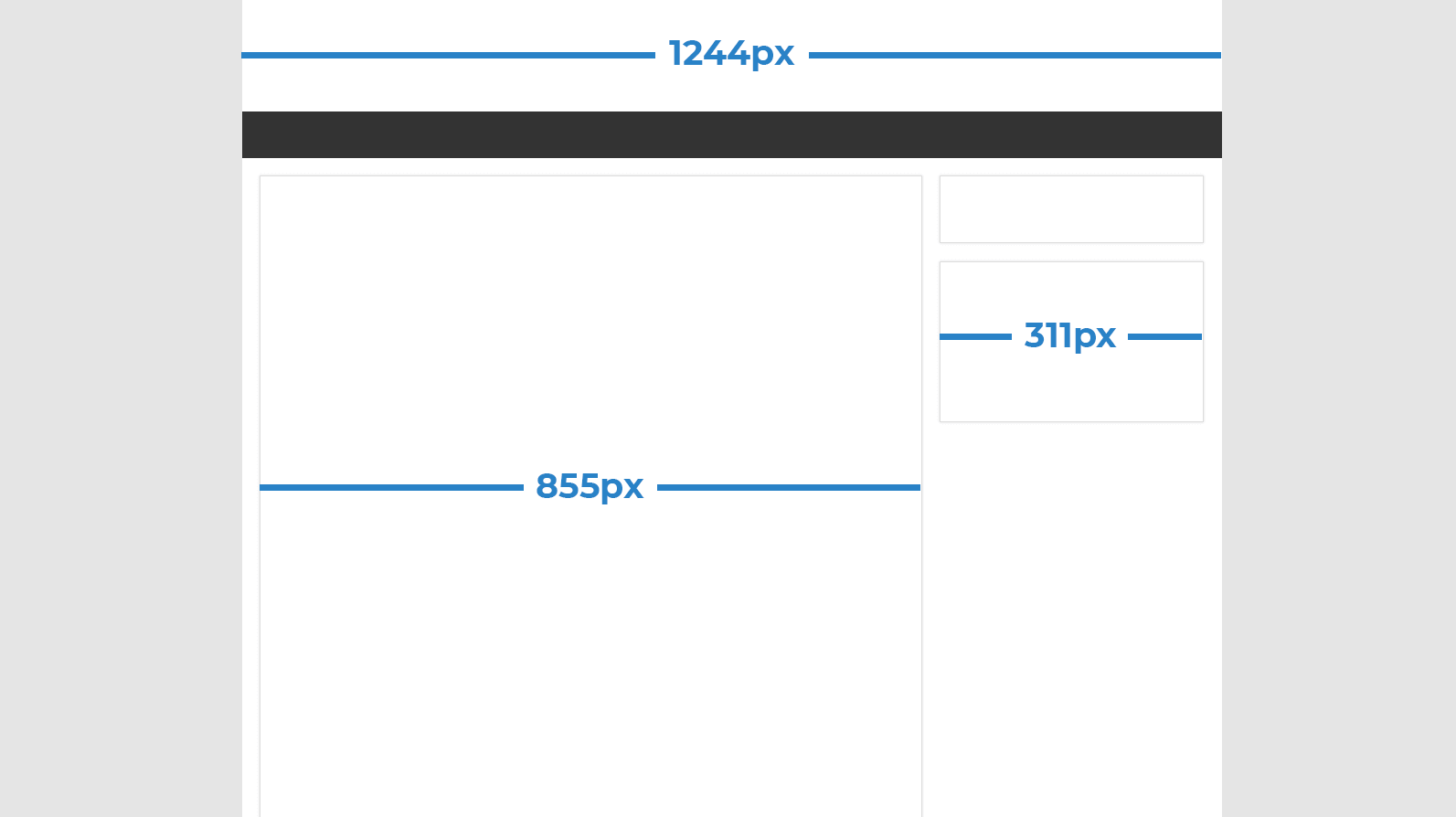
The same misconception exists about using the sizeMapping code to deliver ads based on the device. While it is highly probable that a browser width of 320 pixels is equal to a smartphone, it could also be just a narrow browser window on a desktop device. If you really need to traffic ads to different devices instead of the available space, use the Device targeting within your Google Ad Manager account.
In the traditional Ad Manager code, you need to find the sweet spot between screen width and available space. Continue reading to find a fully automated solution to deliver ads based on the actual available space.
Placing responsive ads
Now that you know the theory about Google Ad Manager responsive ads. Let’s start by creating them.
I am assuming that you know the basics of how trafficking ads through Google Ad Manager works. This includes creating orders, line items, and creatives with different sizes. We will start at a point where you assign sizes to the ad units you later place on your site.
Go to your Ad Manager account and navigate to Inventory > Ad Units. Either click on an existing ad unit or create a new one.
Find the Sizes section in the Settings. Keep the Size mode option to Fixed size, which is the only viable option for ad units on websites. Click on the Sizes option to see a list of available sizes. Start typing either sizes, e.g., “300×250”, or names, e.g., “Medium Rectangle”, and choose from the predefined sizes that show up.
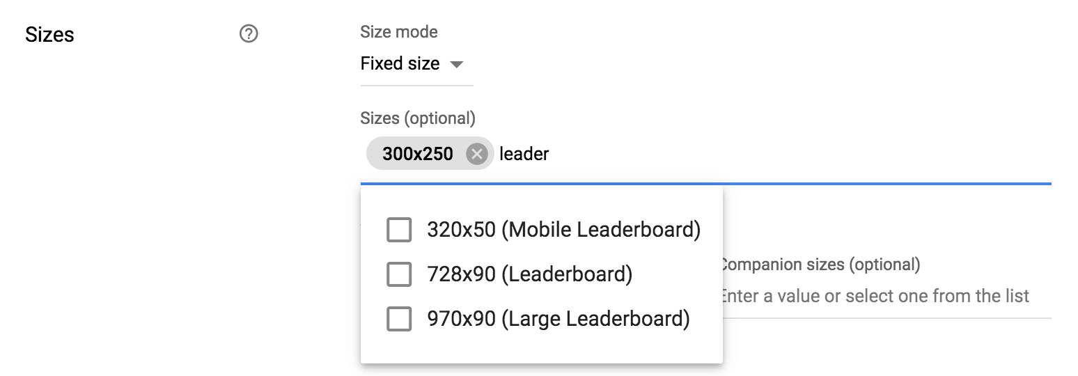
In the following steps, I am using an ad unit with three sizes:
- 320×50 (Mobile Leaderboard)
- 300×250 (Medium Rectangle)
- 728×90 (Leaderboard)
Now that you set up the ad unit to deliver different ad sizes, you need to implement the appropriate codes on your website. I am going to cover two methods here:
Managing ad sizes in WP Admin
The simplest way to change ad units without touching codes is to use the Google Ad Manager WordPress Integration. Learn how to set it up and connect your GAM account here.
Once you select the ad unit in Advanced Ads, you will see the Ad Sizes option with the sizes you set up in your Google Ad Manager account.
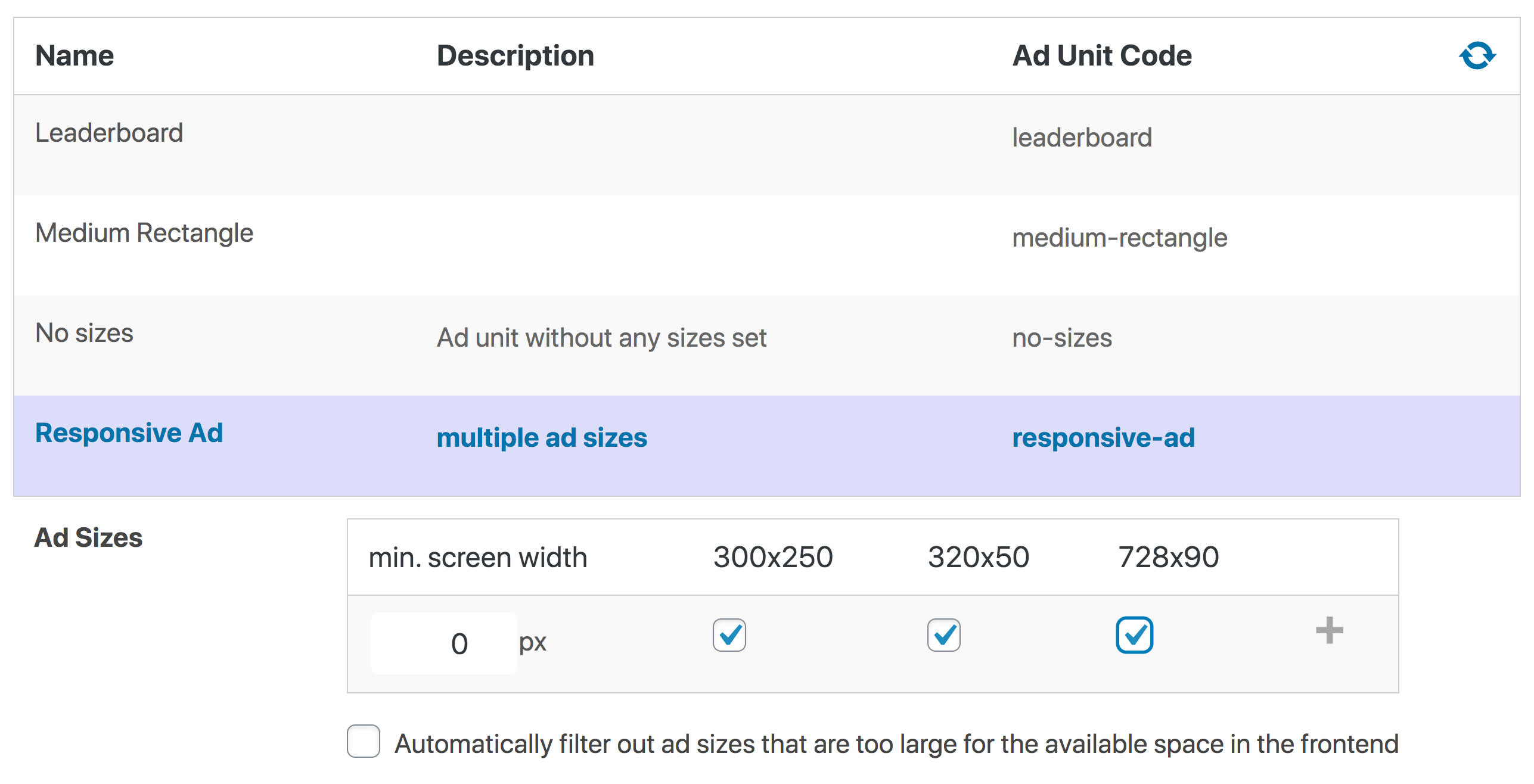
Click on the (+) button to define different sizes for different screen widths. The following screenshot shows an example of delivering the large Leaderboard (728×90) ad on browser sizes above 1000 pixels while placing smaller ads on small devices.
I already mentioned above that placing ads based on screen sizes comes with the risk of delivering ads that are still too large for the actual available space. E.g., in our example above, you might place the advertisement in the content which, in many themes, is smaller than 728 pixels even on large screens.
As a solution, we implemented a feature that automatically checks the available width of the element that contains the ad. Just enable the appropriate option below the sizes table.

That is it. Your Google Ad Manager ad unit is now responsive and should deliver ads based on the available space.
Take a look at the following video to see it in action.
Video: 02:29min
Click on the preview image to load and start the video from YouTube. By clicking you agree that your information will be sent to and processed by YouTube, LLC, 901 Cherry Avenue, San Bruno, CA 94066, USA. Read more
Hard-coding responsive ad units
Use the Ad Manager Integration described above if you are not comfortable with website coding.
If you are used to placing your ad unit codes manually on your website, you can also custom-code responsive ads.
Go to Inventory > Ad units and click on the ad unit you want to place on your site. Choose the Tags tab to get the code.
Under Tag options, you can still adjust the ad sizes you want to use for the ad unit code.
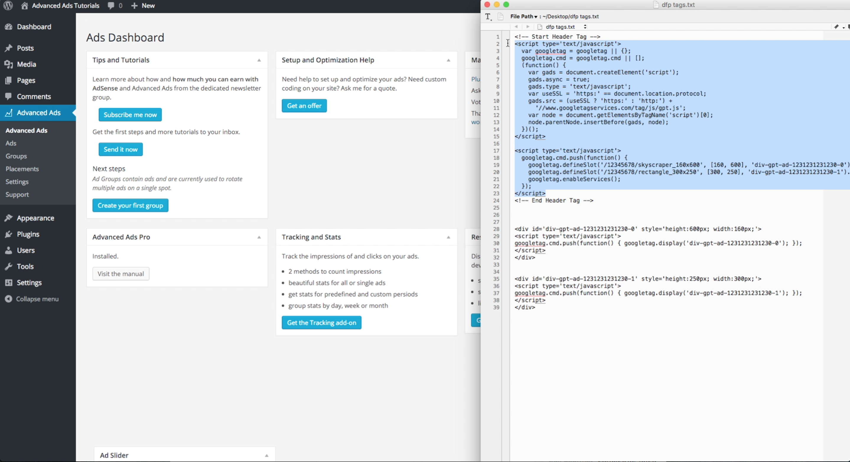
The code that gets into the document header contains a list of ad unit sizes by default.
div {
overflow: auto;
}
.shcb-language {
border: 0;
clip: rect(1px, 1px, 1px, 1px);
-webkit-clip-path: inset(50%);
clip-path: inset(50%);
height: 1px;
margin: -1px;
overflow: hidden;
padding: 0;
position: absolute;
width: 1px;
word-wrap: normal;
word-break: normal;
}
.hljs {
box-sizing: border-box;
}
.hljs.shcb-code-table {
display: table;
width: 100%;
}
.hljs.shcb-code-table > .shcb-loc {
color: inherit;
display: table-row;
width: 100%;
}
.hljs.shcb-code-table .shcb-loc > span {
display: table-cell;
}
.wp-block-code code.hljs:not(.shcb-wrap-lines) {
white-space: pre;
}
.wp-block-code code.hljs.shcb-wrap-lines {
white-space: pre-wrap;
}
.hljs.shcb-line-numbers {
border-spacing: 0;
counter-reset: line;
}
.hljs.shcb-line-numbers > .shcb-loc {
counter-increment: line;
}
.hljs.shcb-line-numbers .shcb-loc > span {
padding-left: 0.75em;
}
.hljs.shcb-line-numbers .shcb-loc::before {
border-right: 1px solid #ddd;
content: counter(line);
display: table-cell;
padding: 0 0.75em;
text-align: right;
-webkit-user-select: none;
-moz-user-select: none;
-ms-user-select: none;
user-select: none;
white-space: nowrap;
width: 1%;
}
]]><script async src="https://securepubads.g.doubleclick.net/tag/js/gpt.js"></script>
<script>
window.googletag = window.googletag || {cmd: []};
googletag.cmd.push(function() {
googletag.defineSlot('/1234567890/responsive-ad', [[728, 90], [300, 250], [320, 50]], 'div-gpt-ad-987654321-0').addService(googletag.pubads());
googletag.pubads().enableSingleRequest();
googletag.enableServices();
});
</script>
Code language: HTML, XML (xml) The [[728, 90], [300, 250], [320, 50]] part tells Google Ad Manager to choose from any of the mentioned ad sizes. There is no limit to a specific screen width in this code.
To deliver ads based on the screen width, we need to apply the already mentioned size mapping options to the code.
We do that by manipulating the following line from the code above.
googletag.defineSlot('/1234567890/responsive-ad', [[728, 90], [300, 250], [320, 50]], 'div-gpt-ad-987654321-0').addService(googletag.pubads());
Code language: JavaScript (javascript)
Let’s take a look at a full example of a size mapping code.
var adSlot = googletag .defineSlot('/1234567890/responsive-ad', [[728, 90], [300, 250], [320, 50]], 'div-gpt-ad-987654321-0') .addService(googletag.pubads()); var mapping = googletag.sizeMapping() .addSize([1000, 0], [728, 90]) .addSize([0, 0], [[300, 250], [320, 50 ]]) .build(); adSlot.defineSizeMapping(mapping);
Code language: JavaScript (javascript)
The magic is happening in the “mapping” part where we combine the minimum screen size, e.g., 1000, with the ad unit sizes that Ad Manager could choose from, e.g., [728, 90], the leaderboard size. The line containing [0, 0]lists the sizes used for all smaller screens.
You can add more than two lines if you want to match more screen widths to different sizes. The order of the sizes doesn’t matter. Ad Manager will try to deliver ads based on the largest screen width first.
If you apply sizeMapping to multiple ad units, make sure they all have different variables (e.g., adSlot1, adSlot2), and other sizeMapping arrays names, e.g., mapping1, mapping2). Otherwise, it might not work as expected or just be too confusing.
The [[728, 90], [300, 250], [320, 50]] code in the slot definition still has a function. It is used as a fallback when Google Ad Manager cannot determine the available screen size. I have not seen a case where this constantly happens, and there is no need to adjust it.
Debugging responsive GAM ads
It is quite simple to test if the ad units on your site request the correct ad sizes from Google Ad Manager. Just open the Google Publisher Console by adding ?googfc to the URL in your website’s frontend.
You can find the ad sizes sent to Google Ad Manager next to the Slot size label in the Ad Slots tab. You can manually change the screen width to see the value adjusting. There is no need to use another device, e.g., a smartphone, to test smaller screens.

If the values you see here differ from what you intended, you might have to adjust your code.
In the Page Request tab, you can verify the browser width detected by Google Ad Manager.
If you still experience an issue, please also look at Debugging Google Ad Manager.
What else to know about responsive GAM ads
You cannot deliver responsive AdSense tags through Google Ad Manager. Instead, you would need to create one fixed-sized AdSense tag per screen width and combine multiple ones to create responsive ads in the GAM-way.
Sizes of creatives are used for targeting and doesn’t have to match the actual size. E.g., you could upload an image with the size of 400×300 as a creative in Google Ad Manager and declare it a 300×250. This would deliver the creative whenever the ad unit requests an ad with a size of 300×250, but actually show it as the original size of 400×300.
Resources
Starting in 2009, Thomas’ own word game website grew to 40 MM page impressions per month. He then built Advanced Ads to help his colleagues to place ads and test different ad positions and networks tests without any coding skills. Thomas now enjoys improving the product for our more than 150,000 users worldwide.


